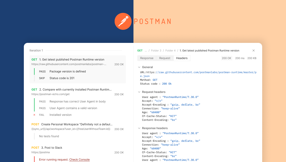
Accessible error signifier for valiables

Key contributions:
- A small UI change to highlight errors in variables that increased success of critical flows.
- Made sure the designs are colour-blind accessible yet not distracting for anyone.
- Went through systematic explorations and user testing to get the team’s confidence.

Background
What is Postman?
Postman is a tool used by software developers to develop, test and deploy APIs aka "developer stuff"
What are variables in Postman?
One integral part of our user's workflow, just like most other developer workflows, is to use variables to improve re-usability and their productivity. However, they had a problem in our product with knowing if the variables were assigned a value. This led to errors that they had to spend a lot of time trying to debug, not understanding the problem was in the variables.
The problem
Are there any errors in my variables?
Why don’t you try to answer this question? From the two variables shown below, which one is resolved and which is unresolved?


I have made this task extremely simple by putting these next to each other, isolated and big. Yet, one could second guess as to which one is unresolved.
Imagine when a user encounters any one of it in the interface among other things. It can lead to a frustrating experience of sending an API request with an unresolved variable, getting an error and then wondering why.
Now the problem seems simple enough. We had used orange (left one) which is our brand colour to show resolved variables and red (right one) to show unresolved because red = error (especially in developer interfaces).
Problem solved! ...or is it?
An obvious solution is to show the resolved variable as green…

Problem solved 🎉
Or is it? Have a look at the following images and decide-


These don't look as good and this is how 1 in 12 men in the world could see.
Yes, we often use red and green to highlight yes and no, stop and go, success and error, etc. but relying only on colours is not accessible for colourblind people.
Designing for accessibility not only benefits people who may not perceive the world as we do but it could make the product more usable by everyone. Let's see how
The solution
Add a red box behind the text to highlight

This not only made the design colourblind accessible but also helped highlight the unresolved errors in a way above the resolved ones.
Imagine a scenario where a user sends an API request with some unresolved variables. The request fails and their eyes are caught by the highlighted things in the UI.
This also invites them to hover over it and gives us an opportunity to provide more information or trigger a flow for them to resolve it.
That is precisely what we did…

This also keeps the UI cohesive without using too many colours to distract.
The result
The small change was able to help the users send lesser requests with the unresolved variables that would eventually lead to an error.


Process of designing a rectangle
Multiple explorations
The change was simple enough and apart from making it colourblind accessible, a no brainer to highlight the errors. However, to make even a small change in primary part of the interface used by millions, you have to make a strong case for it.
In order to be sure we are doing the right thing, I explored as many ways of representing variable resolution as possible instead of settling for one.

Analysing explorations
After having fun on the canvas with these different ideas, I had to enter the second diamond of the design process aka converge by analysing the explorations, finding patterns and short listing approaches.

Consolidating learnings into checklist
While working with a team and having to take a visual decisions, a lot of biases and personal opinions can creep in. In order to avoid it, we tried to set some ground rules about what we exactly expect the result to be based on our discussion so far.

Systematic explorations for testing
After this, we tried to take a systematic look at the explorations and see what are the design elements we are using and how to represent resolved and unresolved variables using those.

With more clarity in our minds, it was time to take things to the court! I mean users. We interviewed 9 people internally and 3 of those had red-green colour blindness. We discovered the most of the users with colourblindness also preferred something simpler like background instead of something very obvious (that we though would be more accessible) as things like borders and dotted lines affected the readability.
And with that we released our design improvement :)

Thank You!
-

Improved debugging flow
Led the problem discovery, journey mapping and design of the debugging flow for API tests in Postman.
-

Engagement in learning
An exploratory research to improve students' emotional and cognitive engagement in class participation.
-

Assistive device to pour
A device that helps visually impaired users safely pour hot liquids by communicating with its form.