
API test reports for easier debugging
Key contributions:
- Enabled faster debugging by optimising for discovery and navigation.
- Used affinity map to find patterns in user complaints and user journey map to align the team.
- Redesigned information flow to enable easier discovery of relevant data while debugging
Background
What is Postman?
Postman is a tool used by software developers to develop, test and deploy APIs.
What is API and API testing?
API (application programming interface) is what helps a piece of software to communicate with another. Let’s say our data is in a box with slits on one side through which we can put things inside, take things out or take a peek at what exists. This becomes an interface to interact with the box.
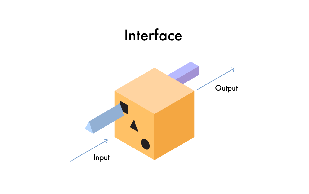
Now for the system to function reliably, certain inputs should give certain expected outputs. Validating this output or response from the server after an API call against a set of expectations is called API (functional) testing.
The problem
What were the users asking?
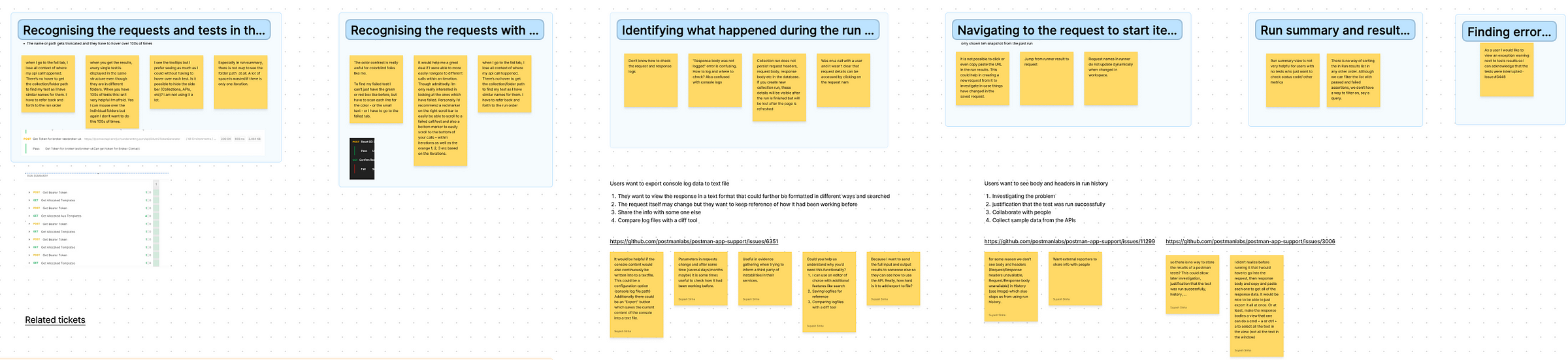
At the start of the project we were looking at isolated user requests that told us to add a link to the request or tests somewhere or export console logs, etc.
I created affinity maps to present these problems with the team in a way to make a case for addressing the testing/debugging experience instead of the isolated Jira tickets.
Secondly, the simplest and most effective tool a team can use while addressing any UX problem is to create a detailed user journey map. Different people carry a different impression of the journey in their head (or none at all) until it is laid out in front of everyone to define expectations and derive a clearer picture.
Getting to the root of the problem
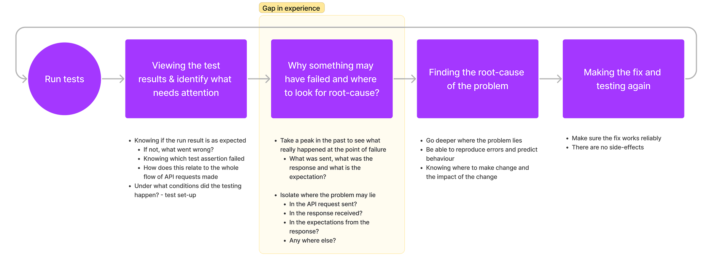
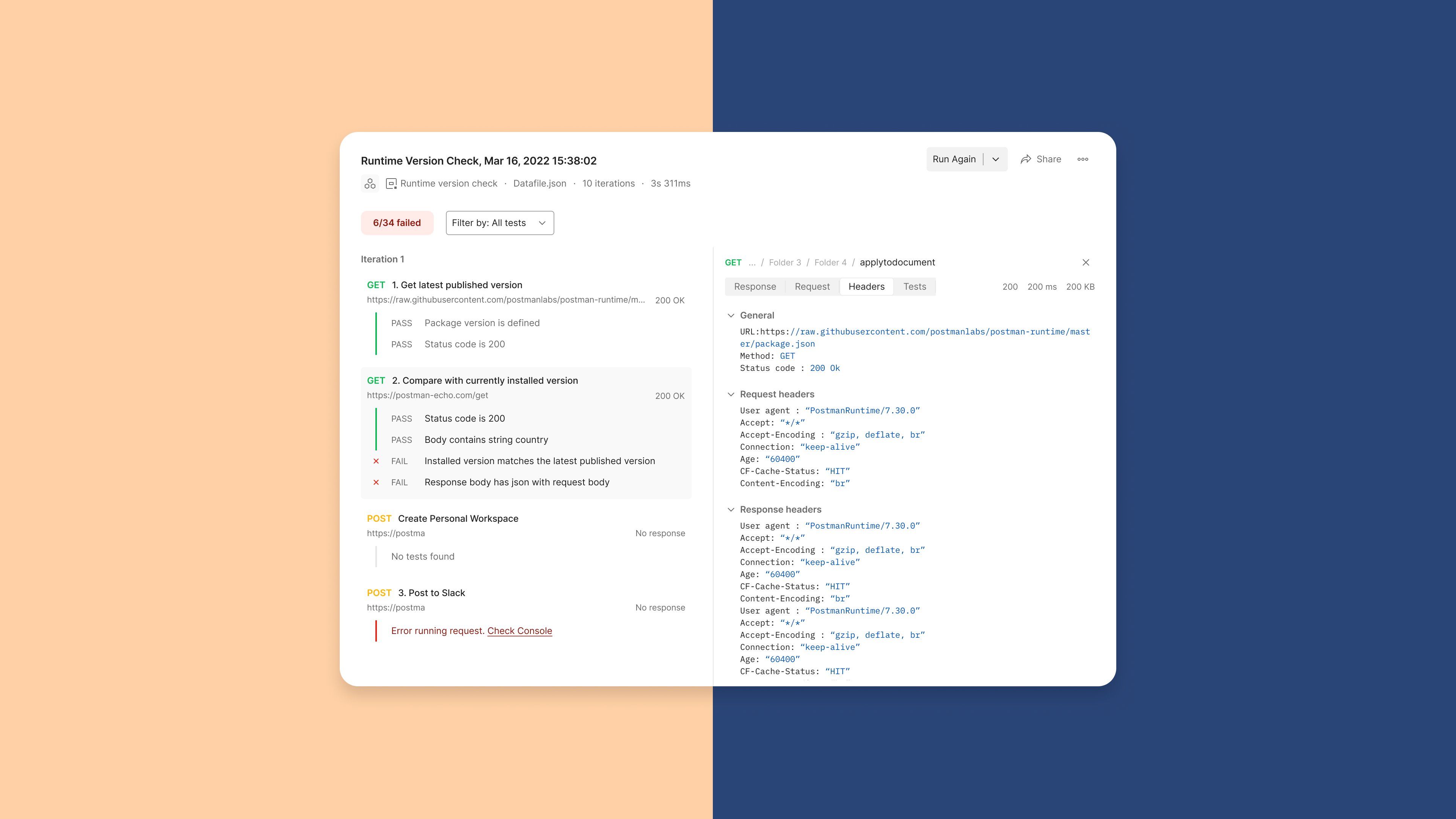
While our product already allowed users to run tests and view a result of what passed and what failed, it did not provide a fitting experience to start the debugging flow. What we realised will help users here was knowing-
- What exactly was sent with the API request?
- What was the response received from the server?
- What was sent or received before and after the point of failure?
- What were the test assertions? (exact expectation that failed)
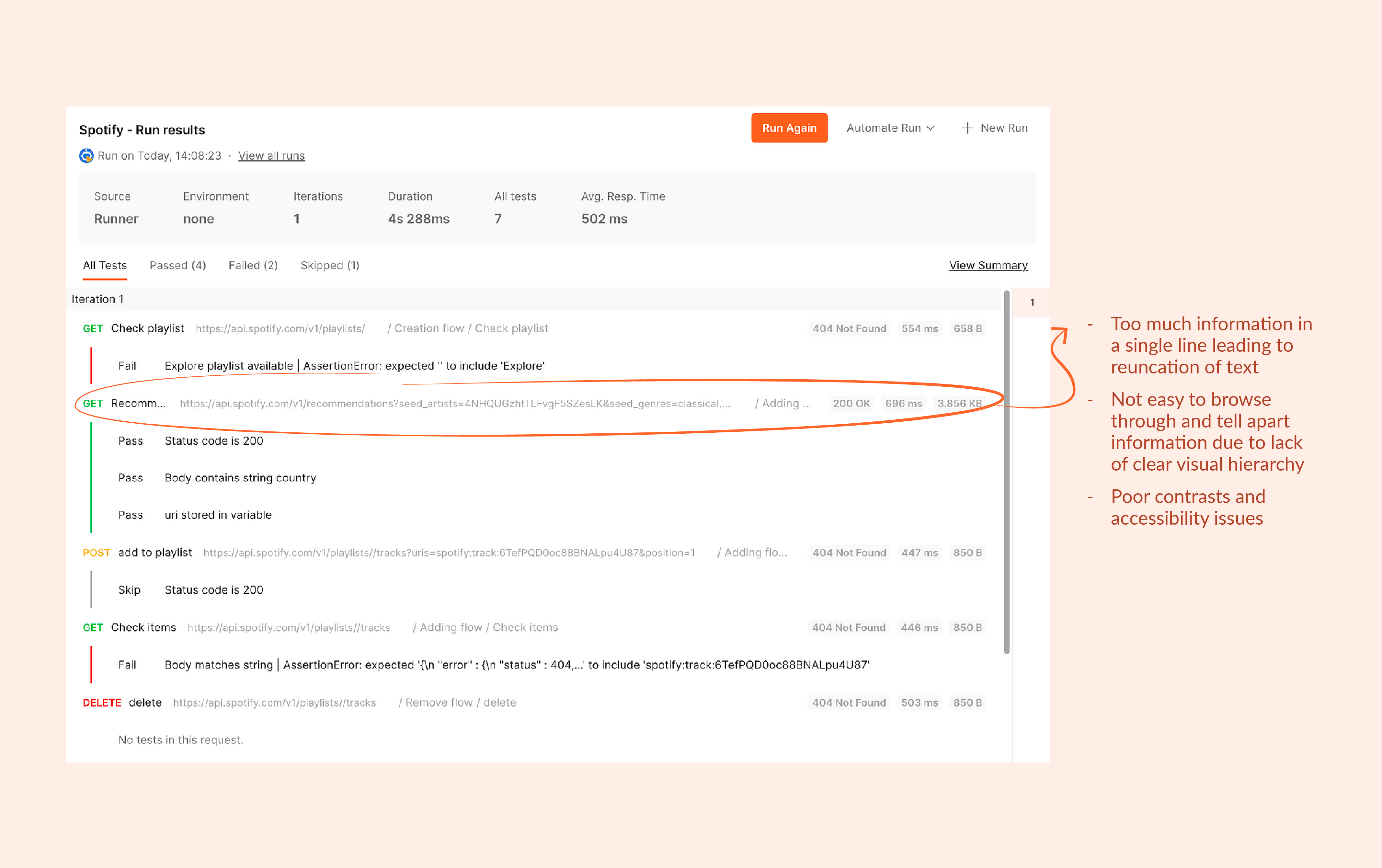
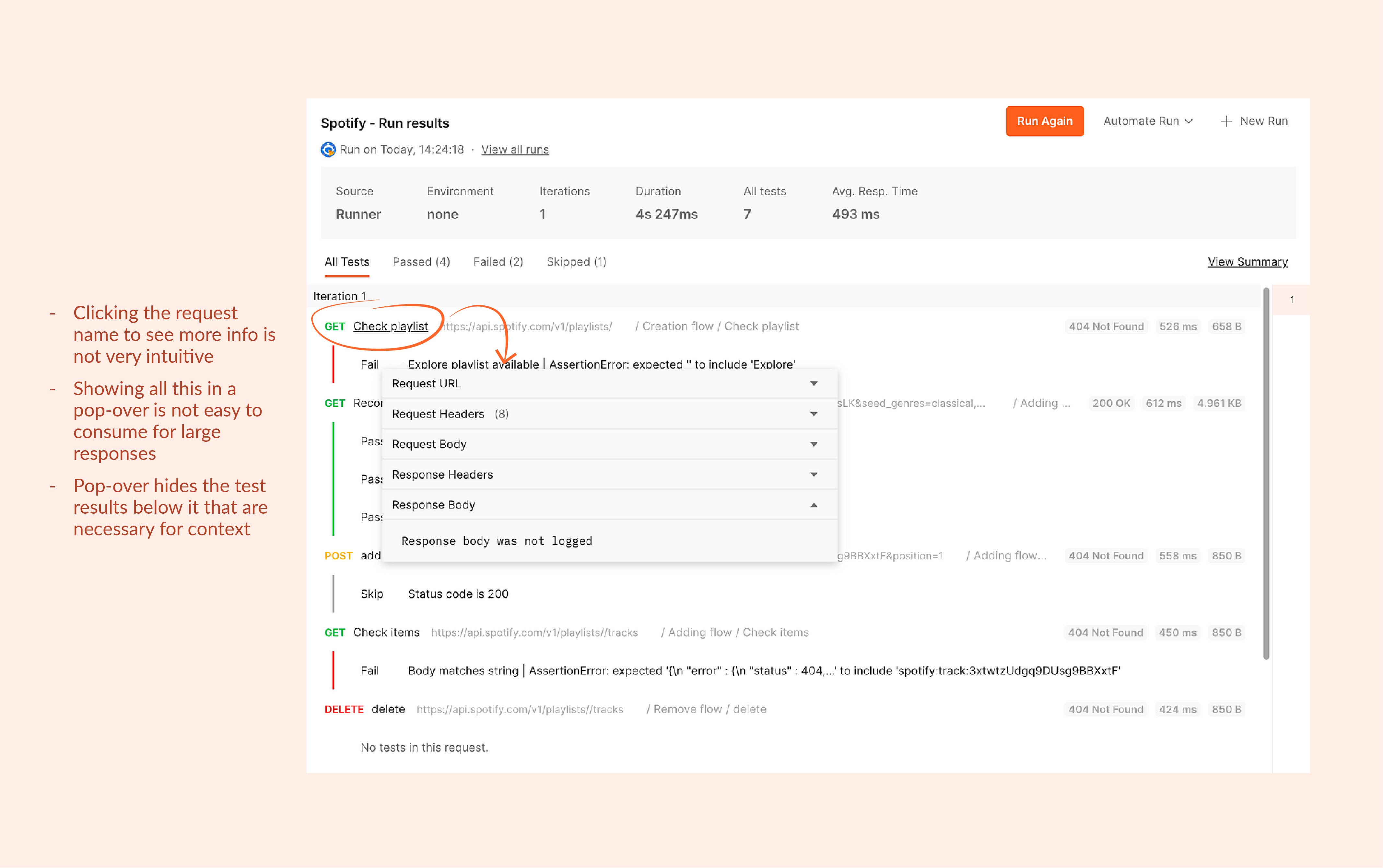
Current state and challenges
Inaccessible information
While we were able to look deeper in the users’ journey and get clarity into what was needed, there were some challenges we faced-
- It was a challenge from the back-end to store all this information at the time of run and it could slow down the operation.
- Requests sent and response received have a lot of different type of data like status codes, headers, body, etc. Representing them in an easy to consume way can be a challenge.
- We had an existing interface that a lot of users were used to. So we had to find a balance between re-imagining certain flows and maintaining the familiarity to not affect what was already solved for.
Explorations and solution
Approach: Two-panel selector
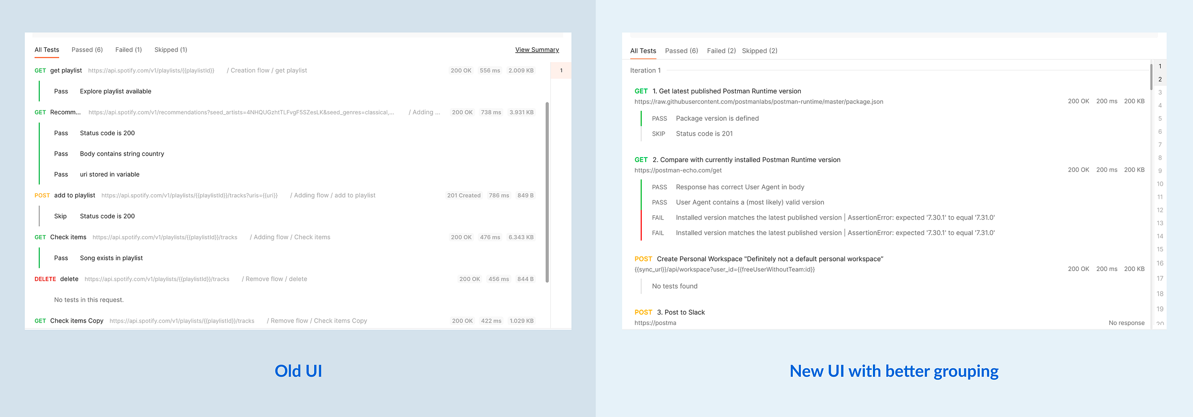
After trying out a bunch of layout and interactions that would make way for a logical debugging flow, we decided on the two-panel selector approach.
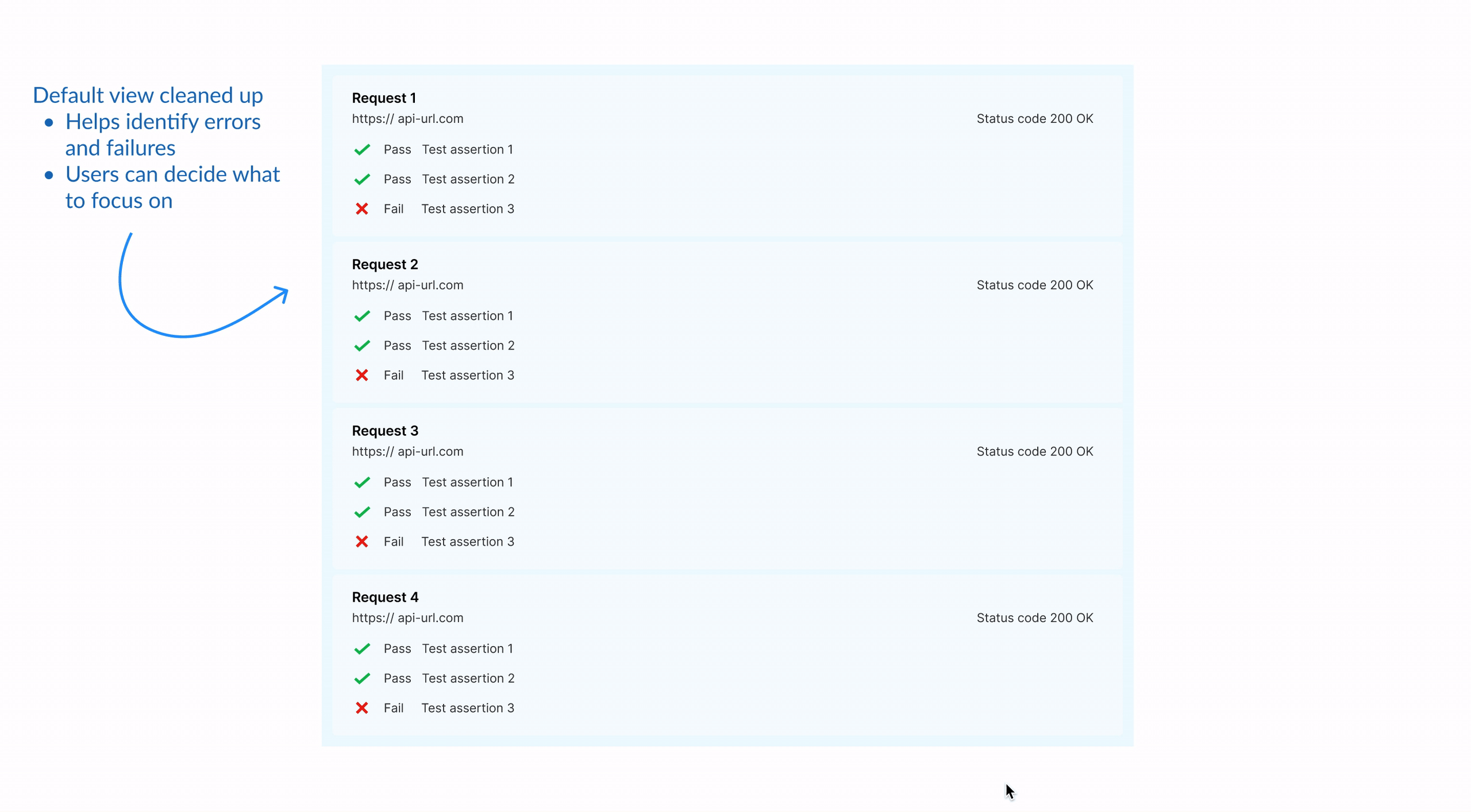
- The default view is visually not very different from the old UI making it easier to transition.
- The job of going through the test results and decide what to focus on can be done alongside the second job of identifying areas of failures without losing context or disrupting the flow of information.
Exploring information structures

I tried different layouts to establish the intended flow of information. Although we did not want to change the existing UI drastically in one go, I thought of experimenting with progressive disclosure to optimise for cognitive load instead of clicks.
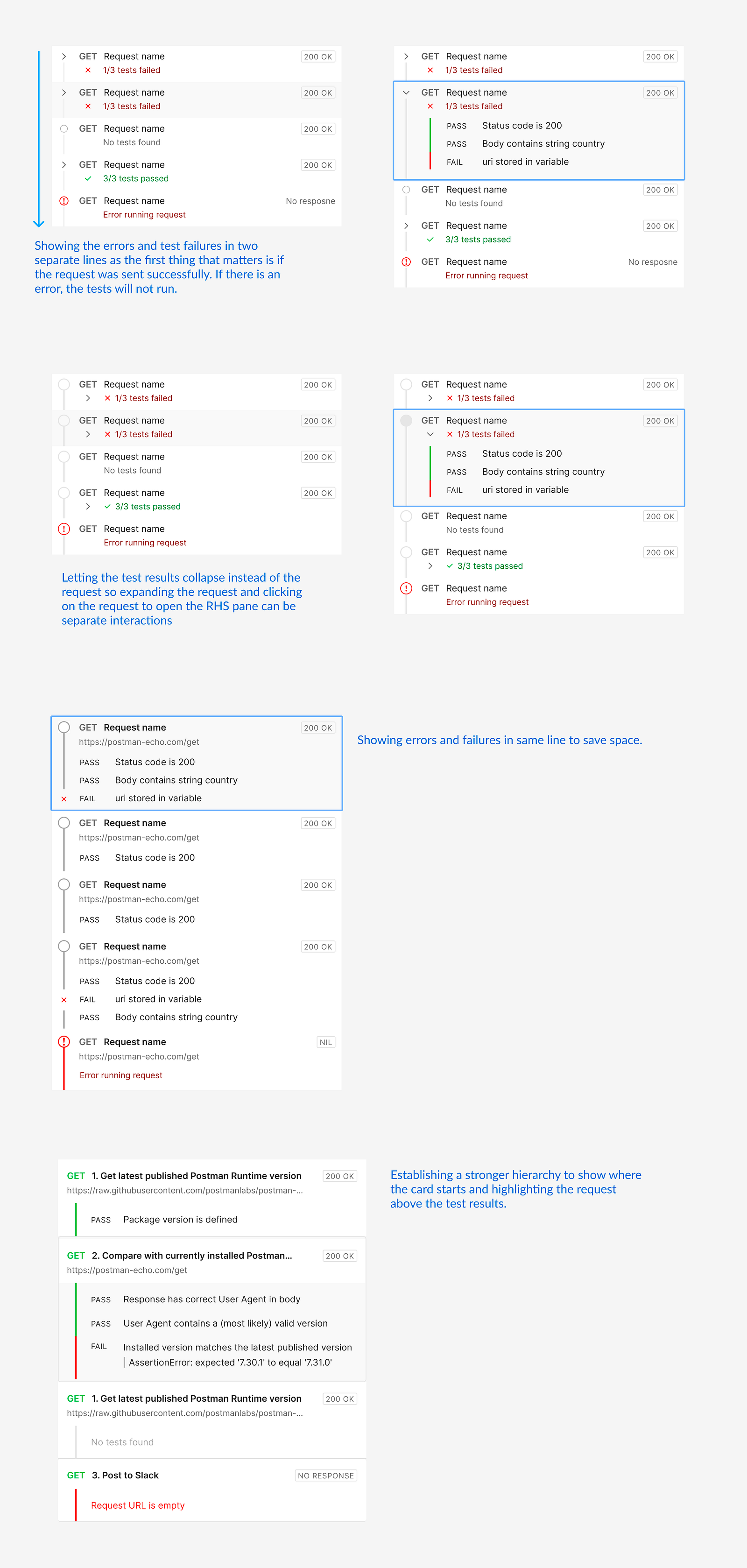
Typography and proximity for better visual grouping
Having experimented with these ideas, we wanted to reach to a desired flow with smaller validated changes. Hence, to improve the UI I had to rely on the fundamental principles- typography and proximity for better visual grouping.
Exploring layouts for right hand side pane
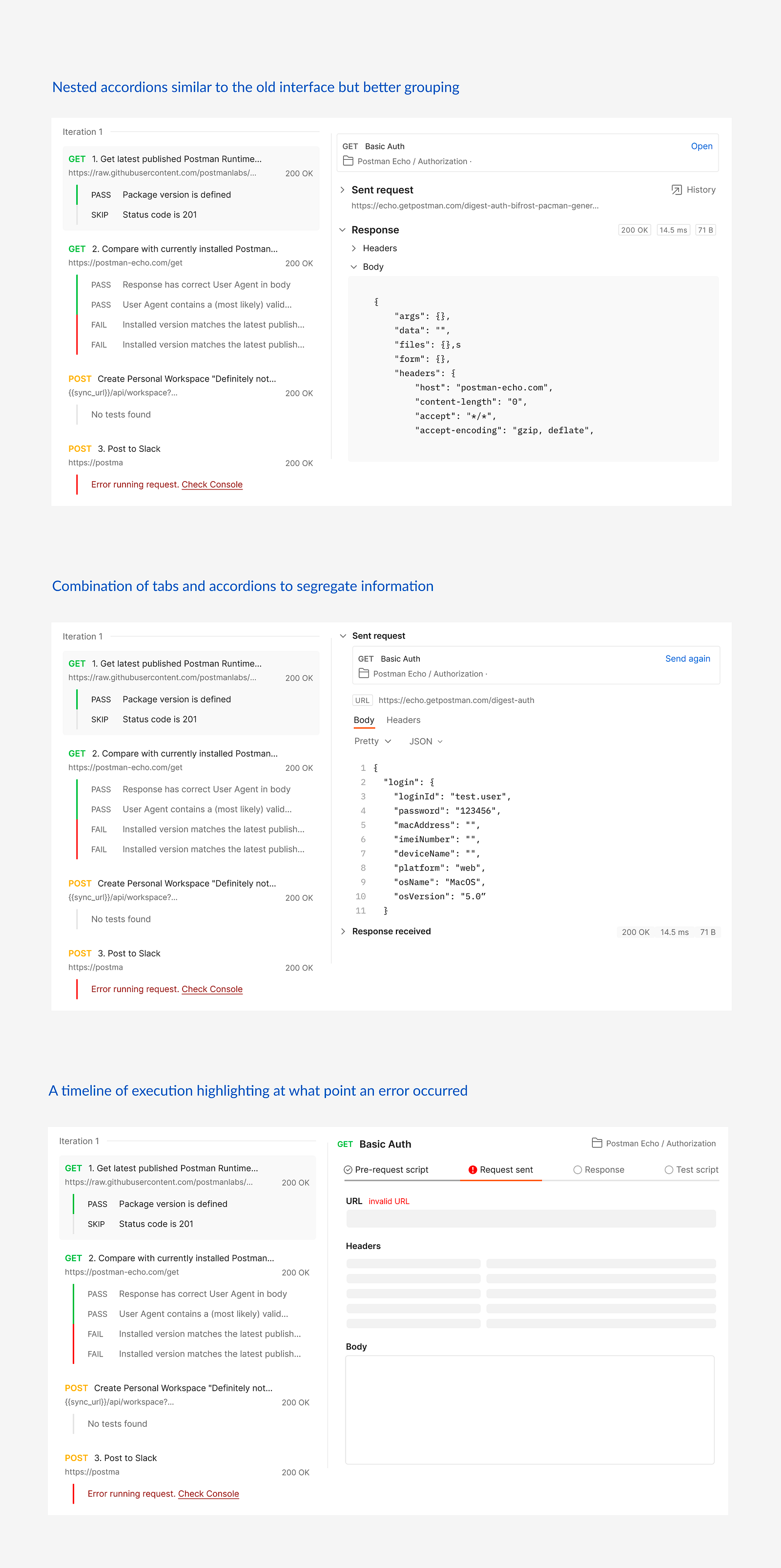
While there were different types of information to be shown, we had to aggressively prioritise for the use-case instead of presenting everything and letting the users struggle with it.
The last approach seemed interesting for debugging errors in request execution but debugging the test assertions was a different scenario. In the latter, the response body was what mattered the most and needed enough space to be consumed properly.
"Confused?!" Going back to the user journey
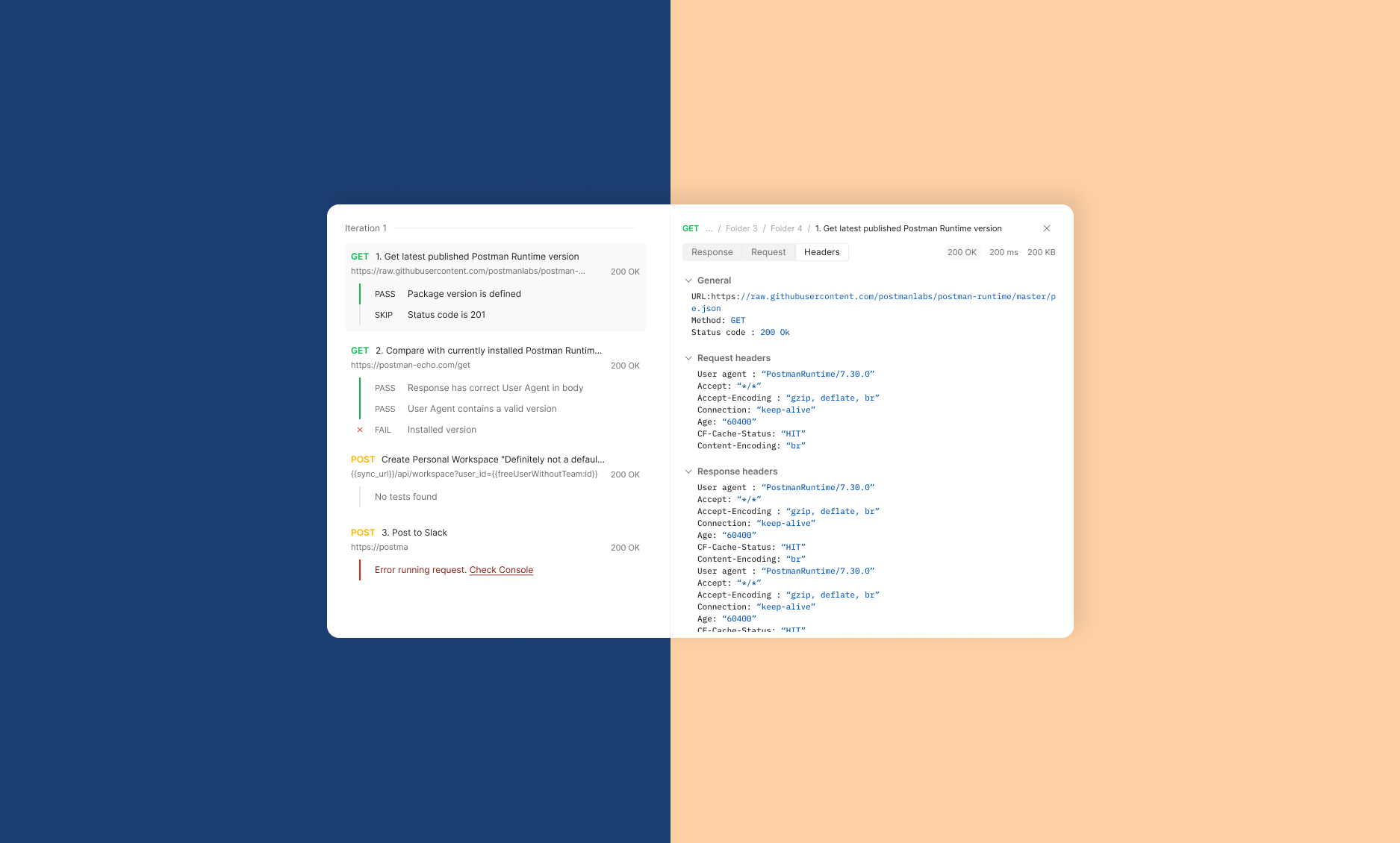
We went back to the user's debugging journeys in different real-life scenarios and came across the network tab in inspect tool of the browser. This is something developers often use while debugging on the web and we thought to base our designs on a similar experience.
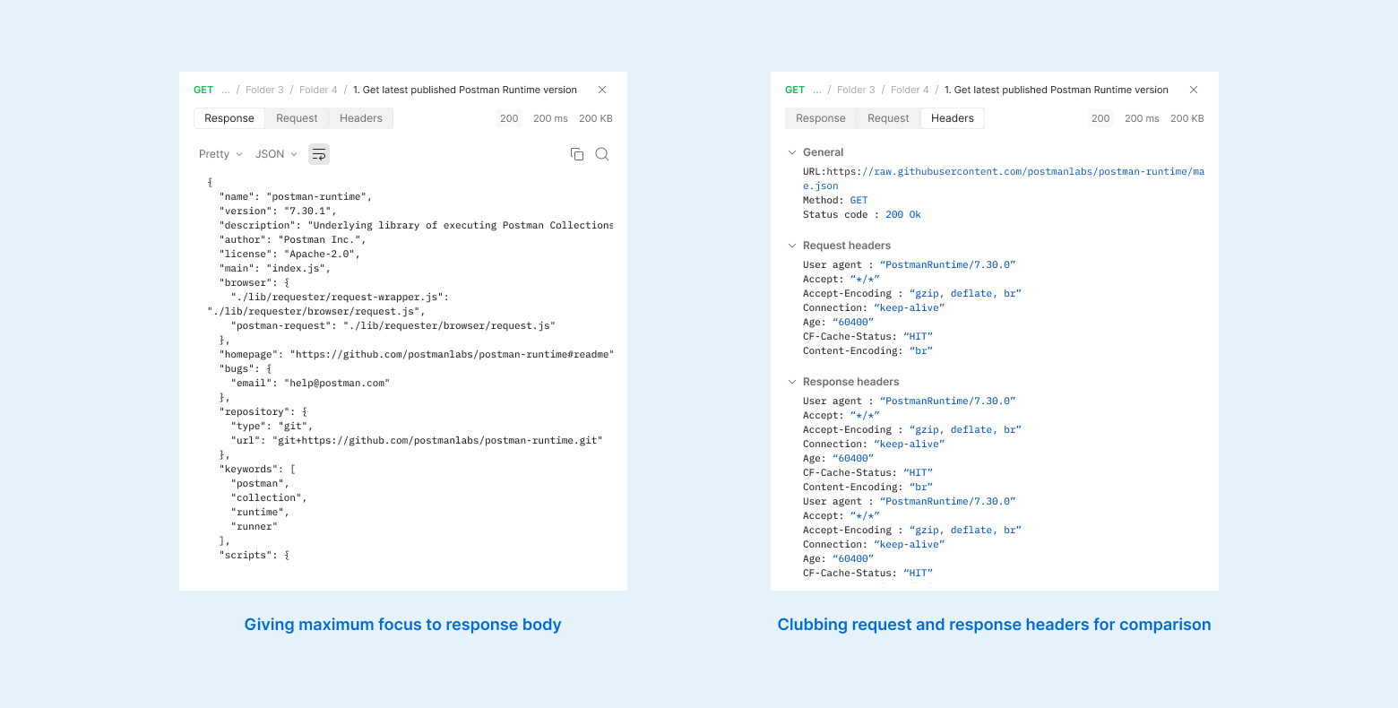
With this we tried to keep the UI as simple as possible and minimise the information as well as navigational load.
- Request body is the most important information so we give it the complete pane with ability to format, search through and copy.
- Headers include other meta information that is used to communicate with the server. Clubbing request and response headers together helps users compare and understand this communication.
Conclusion
Measuring impact
The debugging journey is very iterative and users may have to run the tests again and again after making some changes. To measure the impact of our improvements, we tracked the number of intermediate runs it takes to debug a test as well as the final number of runs with successful tests.
Our findings almost 3 months after the release of the improvement revealed that only slightly more tests were debugged with less than 5 intermediate runs (~5% change) and lesser took more than 25 runs. The number of successful runs also increased by only 1%.
Thank You!
-
Accessible error signifier
A small change big impact story of creating subtle yet effective error signifiers and reducing the error.
-
Engagement in learning
An exploratory research to improve students' emotional and cognitive engagement in class participation.
-

Assistive device to pour
A device that helps visually impaired users safely pour hot liquids by communicating with its form.